Theme Requirements
To run WordPress Theme we recommend using a host that supports:
PHP version 5.6 or greater.MySQL version 5 or greater OR MariaDB version 10.0 or greater.
We recommend you make sure that your server PHP configuration limits are as follows:
max_execution_time 600max_input_time 600memory_limit 256Mpost_max_size 128Mupload_max_filesize 128Mmax_input_vars 3000
Theme Installation
Step by step instructions for install WordPress Theme:
- Login to WordPress admin panel
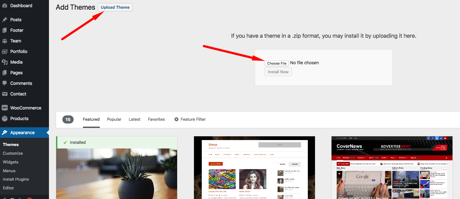
- Go to: Appearance > Themes
- Click on the Add New button, then click on the Upload New
- Upload theme zip file
- Click on the Activate button
If you have some problem with this method please try another instalation way.
Supplementary link with description of theme installing via FTP or CPanel:
Plug-ins Installation
After completion of theme installation process at the top of the WordPress admin panel you should get a notice with the list of required and recommended plugins.
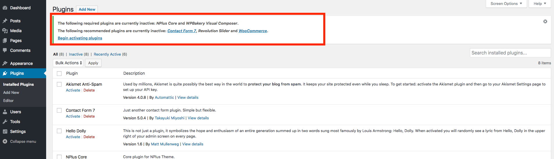
List of required plugins:
- Stoni Core - theme core plugin (required for using all custom modules, post-types, theme options and more other);
- Elementor Page Builder
List of recommended plugin:
- Contact Form 7 - plugin for easy create contact form
- Revolution Slider - plugin for create beautiful slides
- WooCommerce - use this plugin for your shop
Child Theme
A WordPress child theme allows you to apply custom code changes to your site and dont lose it with update of main theme.
After theme installation, you can install child-theme. Please find it in the downloaded folder. You can same way install child theme as like parent theme.
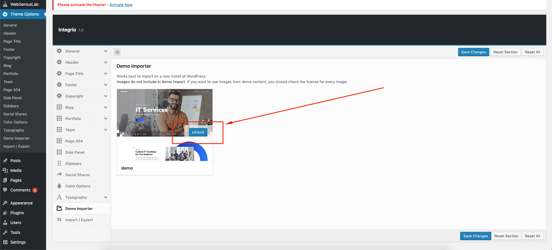
Demo Content
Our Theme have One Click Demo Import
Please follow a few steps to make it:
- Go to Theme Options -> Demo Importer
- Click on the Import Demo button
Theme Options
Like a theme options panel in our product, we use Redux Framework. It is very easy to use.
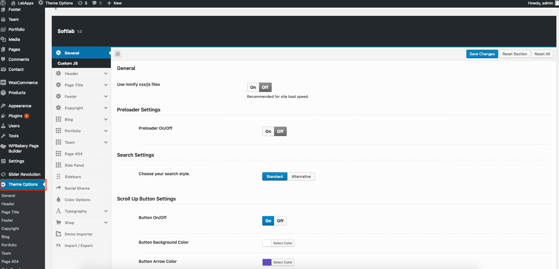
In this panel you can customize fields like that:
- Use minify css/js
- Preloader (on/off, colors)
- Back to Top (on/of, colors, border)
- Custom JS
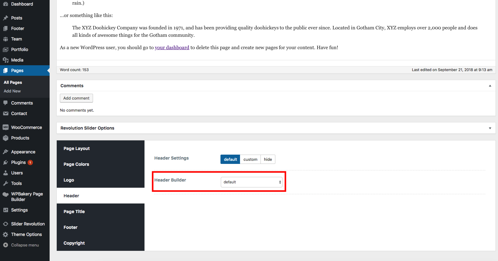
- Header
- Logo
- Header Builder with header preset and settings
- Sticky builder with settings
- Mobile builder with settings
- Page title
- Main layout settings for page title
- Typography page title
- Footer Settings
- Copyright
- Blog (single, archive)
- Portfolio (single, archive)
- Team (slug, title background)
- Page 404 (title background)
- Sidebars (Register sidebar, layout for page)
- Color Options (main theme color, body background)
- Typography
- Main content (content typography, headings main setting)
- Menu typography
- Heading typography (h1-h6)
- Shop
- Catalog (layout, page title, columns, product per page)
- Single (layout, page title)
- Related product (columns, count of items)
- Cart
- Checkout
- Demo Importer
- Import Export Theme Options config
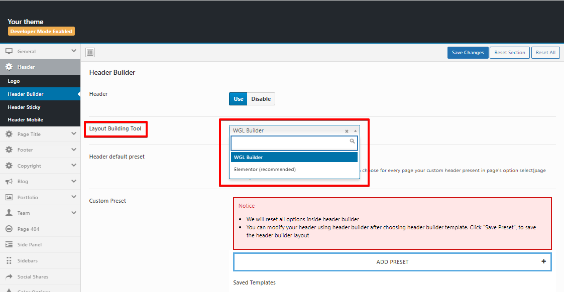
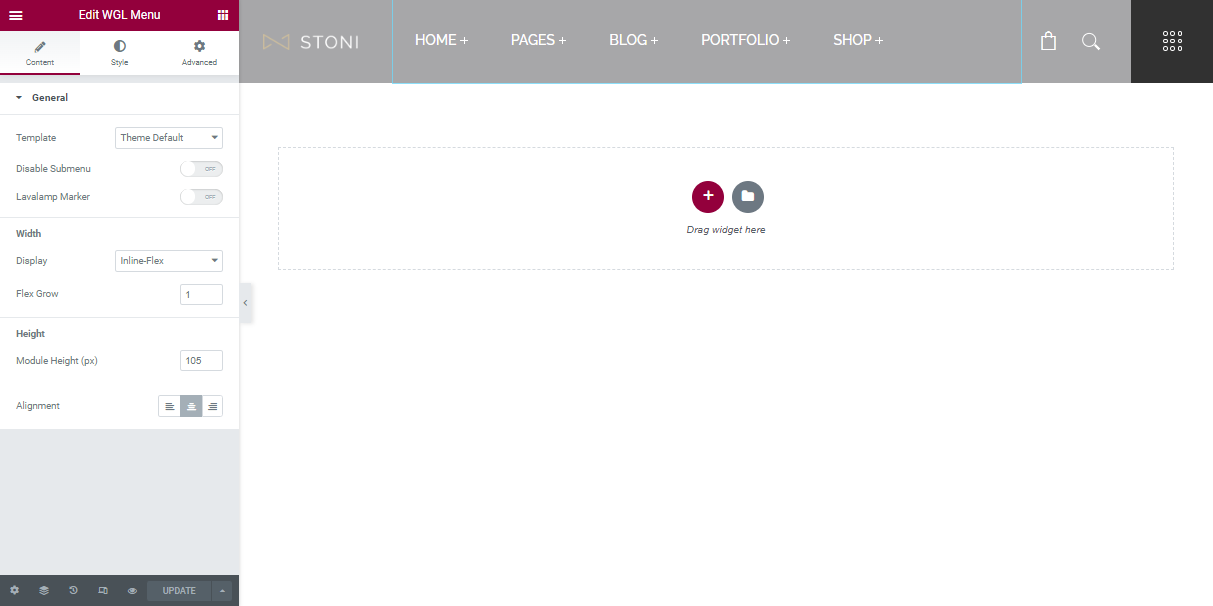
Header Builder
In our product for easy customize header you can use our own developed tools Drag&Drop Header Builder and Elementor Header templates With these Header tools you can create "header preset"/"header template", select one of these presets globally and on every page, you can set locally different header.
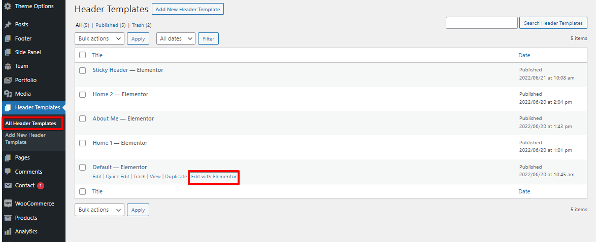
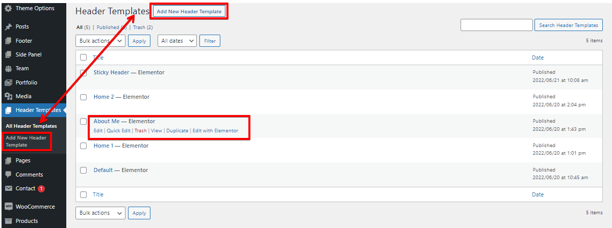
Elementor Header templates
You can find Header Templates in the admin panel > Header Templates > select the required one > Edit with Elementor.We have created special modules for use in the Header Templates: Logo, Menu, Current Date, Delimiter, Icon + Text, Search, Side Panel Button
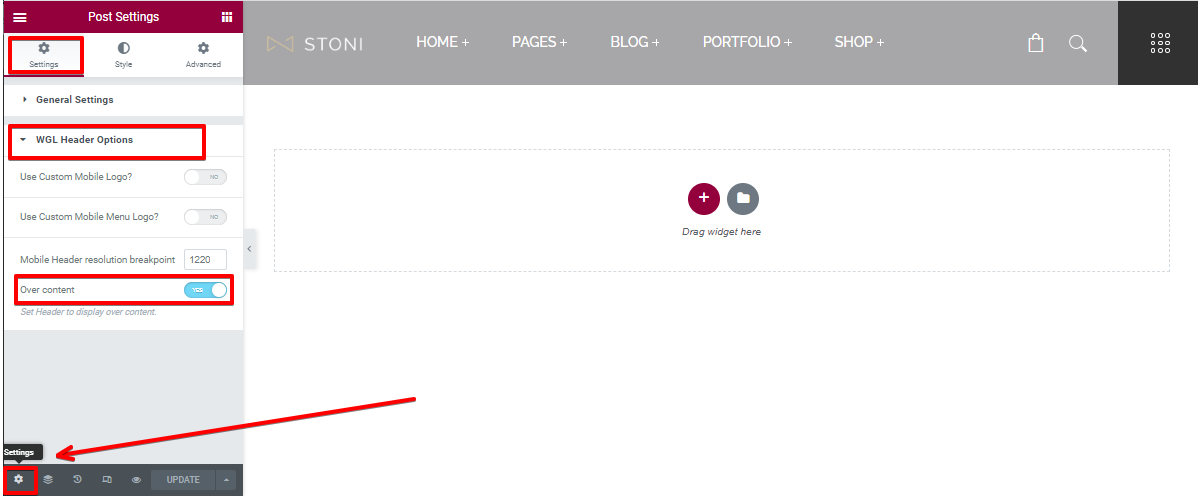
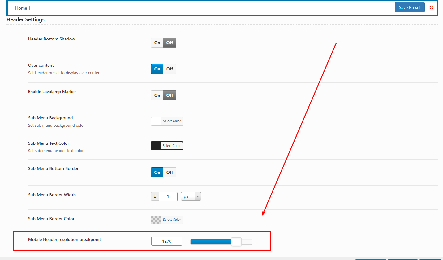
To manage the Breakpoint you need to click on the Settings at the left lower corner > WGL Header Options > Mobile Header resolution breakpoint.
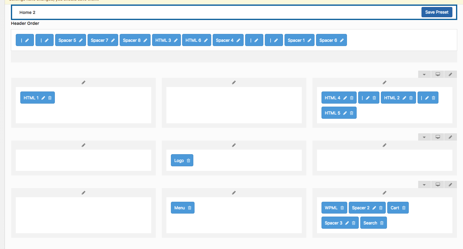
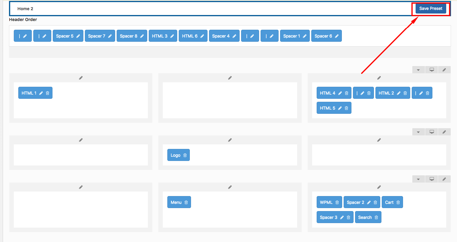
Header Builder
In the header builder exist three rows with 3 columns, it's enough to create any header style that you can imagine for yourself. Rows and columns have settings for the styling (width, background, colors, border, alignment). For element edit, click on the nearest pencil and you will get a popup with settings.
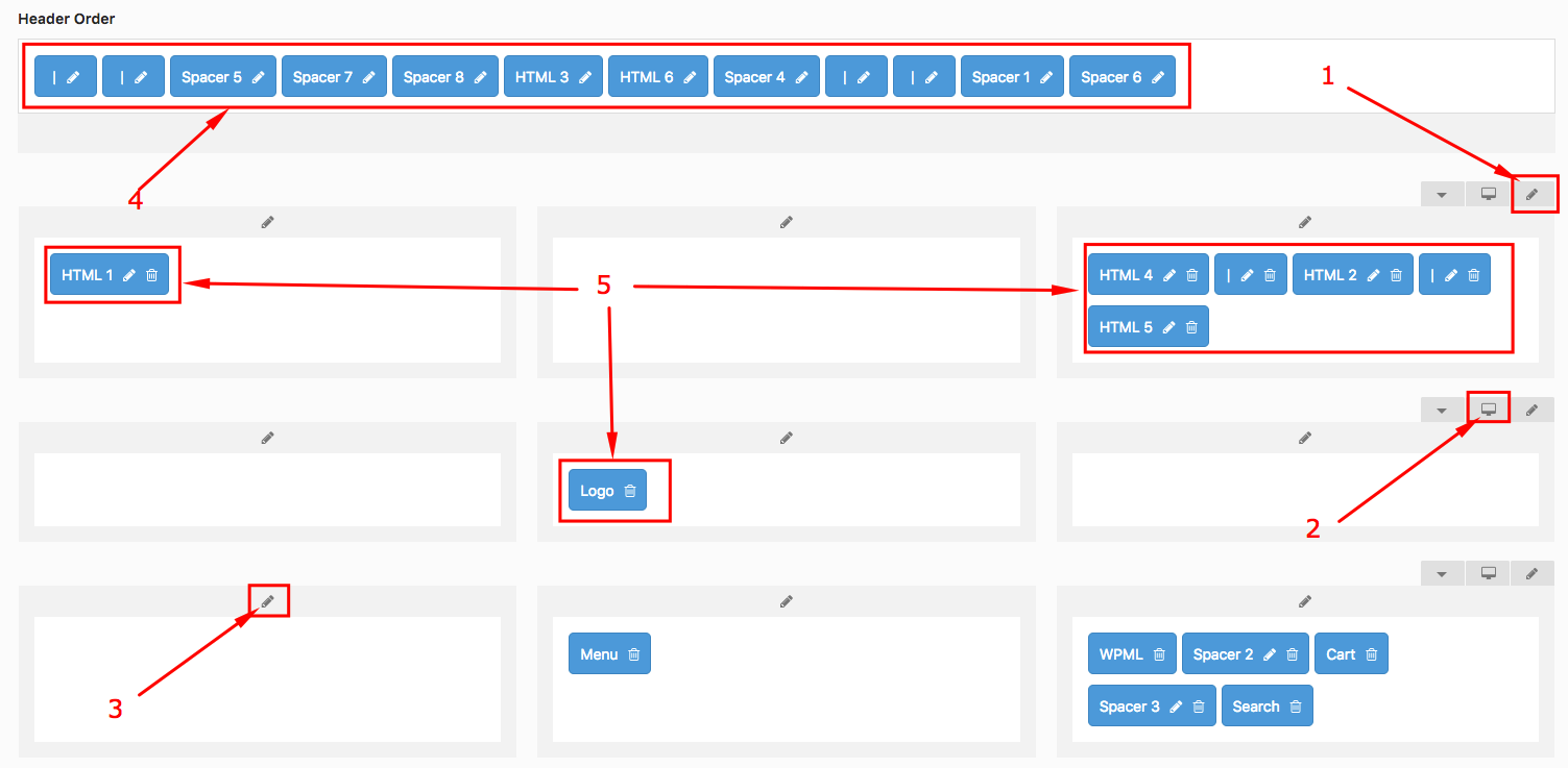
- Pencil for getting the popup with settings for the row.
- Click for hiding or display header row.
- Pencil for getting the popup with settings for columns.
- None active elements in the header (drag & drop it to any columns).
- The elements which exists in the header.
To manage the Breakpoint inside the Header Builder tool scroll to the bottom of the page > find Mobile Header resolution breakpoint. Here you can play with settings till it won’t comply with your requirements.
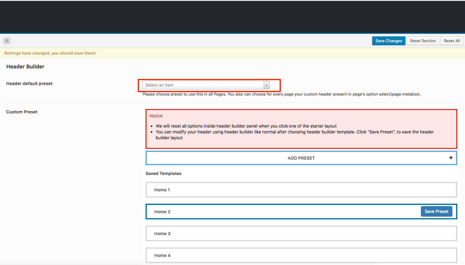
Follow a few main rules to edit or create Header:
1. Select Header Preset from the list or create new for get it active in Header Builder.
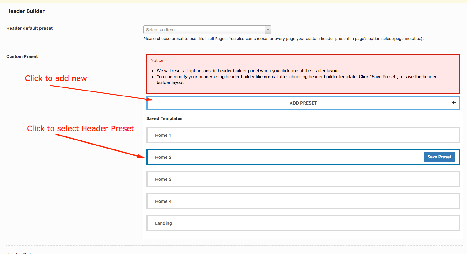
2. Go to Header and customize it.
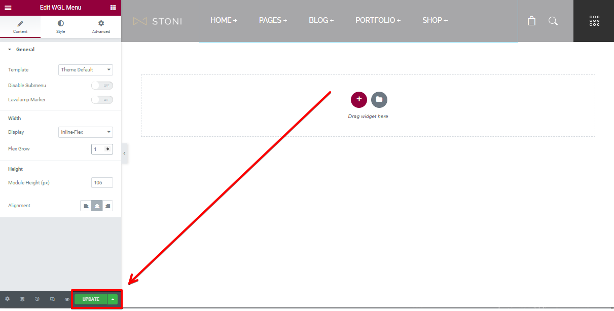
3. Click to "Save Preset"\"Update"
4. Don't forget to apply your header preset globally or in any page.
Page Builder and custom modules
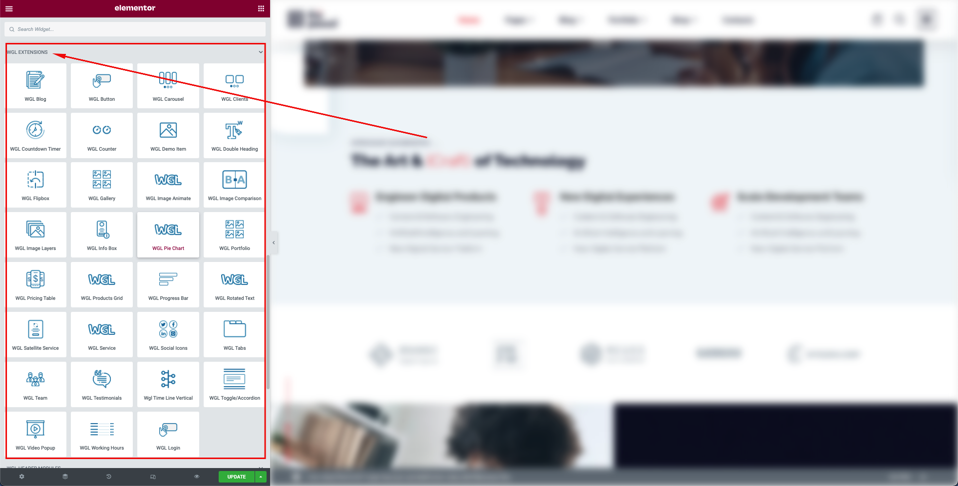
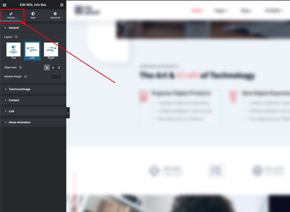
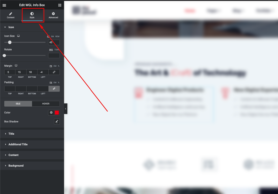
Our theme has a lot of flexible modules. You can use that with one of the best page builder (Elementor). Every module has a lot of options: size, color, alignment, style types. This flexibility gives you a possibility to built a theme according to your needs .
Every module has an icon which is a small visual presentation of the module.
"WGL Extended" is a group of very customizable modules developed by our team. Strongly recommended for use in our themes.
Every module has extended settings of colors, typography, alignment and queries:
List of content modules:
- Counter - display counter with title and description
- Carousel - use this module and rotate any modules
- Testimonials - module for display feedback from a client
- Info Box - can be used for presentation beautiful info with icon, title, text and button which is linked to something
- Flip Box - similar to an Info Box module but animated with flip effect
- Image Layers - provides you ability to create animated layered images
- Pricing Table - display your price policy with price table
- Message Box - displays important message for users (info, error, warning, important, etc.)
- Button - one of the main content element with flexible style settings
- Double Headings - custom style of heading
- WGL Text Module - set your own styles and font-family on the text
- Countdown Timer - гse this module as a countdown timer before your events occur
- Video Popup - display video within the popup in sace of user's click on the special button
- Spacing - regulate spacing between content elements
- Clients - display logo of your clients with link and animation
- Social Icons - style social icons as you wish
- Time Line Vertical - display timeline of main events
- Time Line Horizontal - display timeline of main events
- Progress Bar - display your skill with the percentage bar
- Divider - add the divider for better visual hierarchy
- Portfolio List - show grid of items with animation from Portfolio post-type
- Team List - show grid of items with animation from Team Members
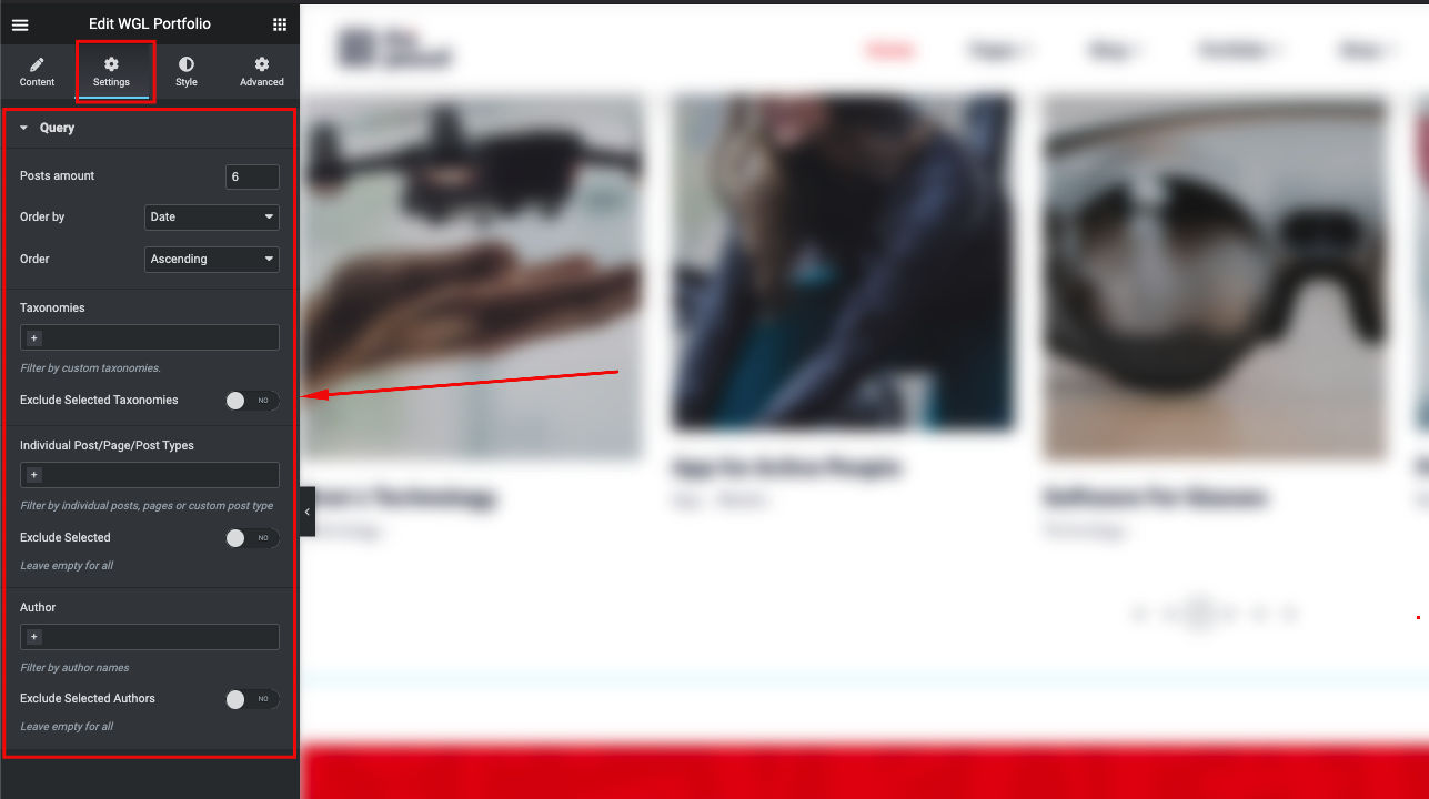
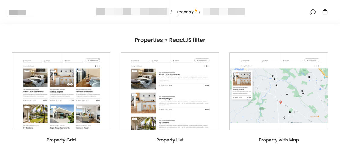
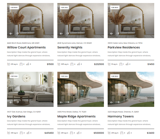
WGL Real Estate (Properties)
The Properties tool provides the ability to display spaces for rent/sale, with all required equipment. WGL Real Estate plugin is responsible for these features. The plugin comes bundled with the theme.
The Properties have three types of layouts that will fit any requirements. There are three types of layouts powered with ReactJS:
- Properties Grid
- List of Properties
- Dynamic Map with popups
The Prorepties tool could be managed in the same way as other post-types: in Theme Options - default settings for all items, and in Property details - for individual configuration of every item.
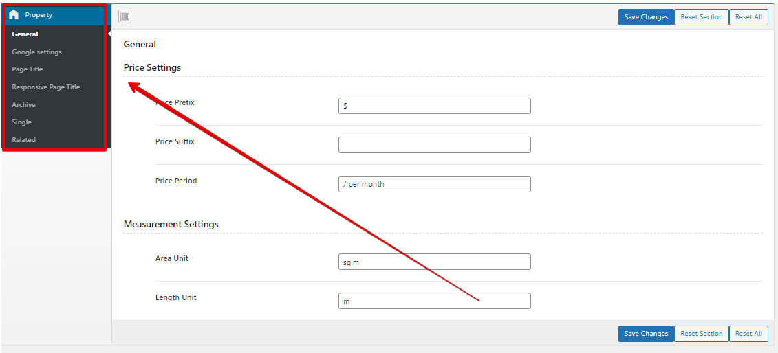
General properties settings in the Theme Options:
- General - price and measurement settings.
- Google Settings - area for Google API Key (generate your personal API key to manage the map) and the Map styles.
- Page Title - manage Page Title settings (image, breadcrumbs, height, alignment) for the Desktop.
- Responsive Page Title - manage Page Title settings (paddings, height, font-size) for the responsive.
- Archive - appearance settings. Also, it contains the ability to manage the filters (select for which values it will be filtered).
- Single - basic appearance settings (BG image, paddings, on\off meta).
- Related - related posts options.
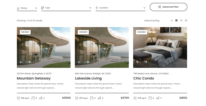
Archive + ReactJS Filter
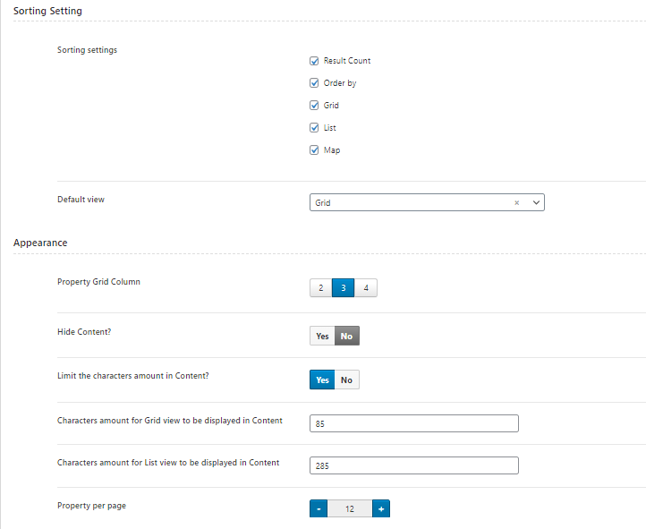
In Theme Options > Properties > Archive you can manage the layout of the Properties Archive page (storage of all posts). There are available options for managing filters, sorting and appearance settings.
- Filter Settings - here you can find the filter based on ReactJS:
- Sorting Settings- select sorting and type of view.
- Appearance - manage the layout: amount of columns, number of values,visibility of content and etc.
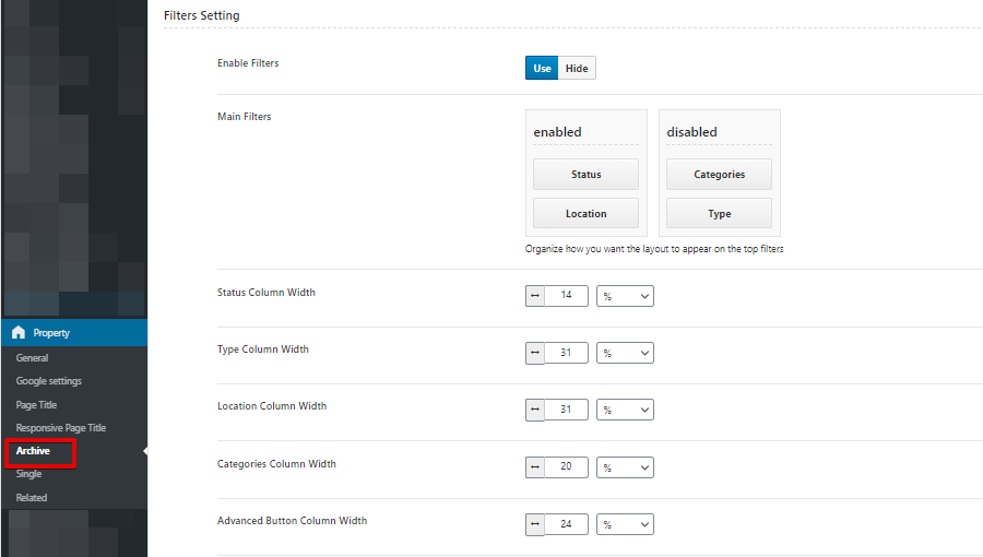
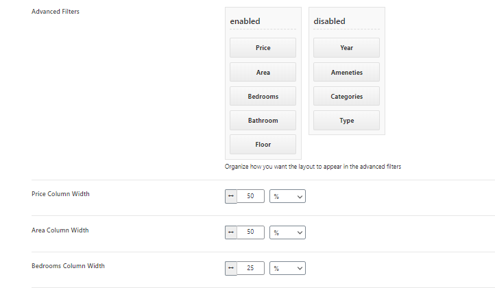
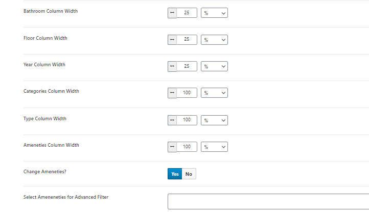
The Filters have some main values like: type, categories, location, status. If you don't want to filter by some value, you just need to move it to the next disabled column. Also, here you can manage the column width.
Single Property
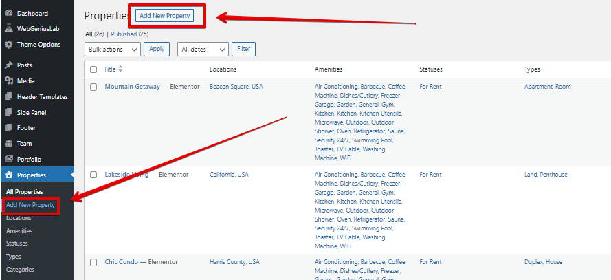
In order to create a new Property item you need to go to your dashboard > Properties > Add New Property:
The global settings for the Single Properties could be found inside the Theme Options > Property > Single. Inside the Property details there are a bulk of individual options for every property item.
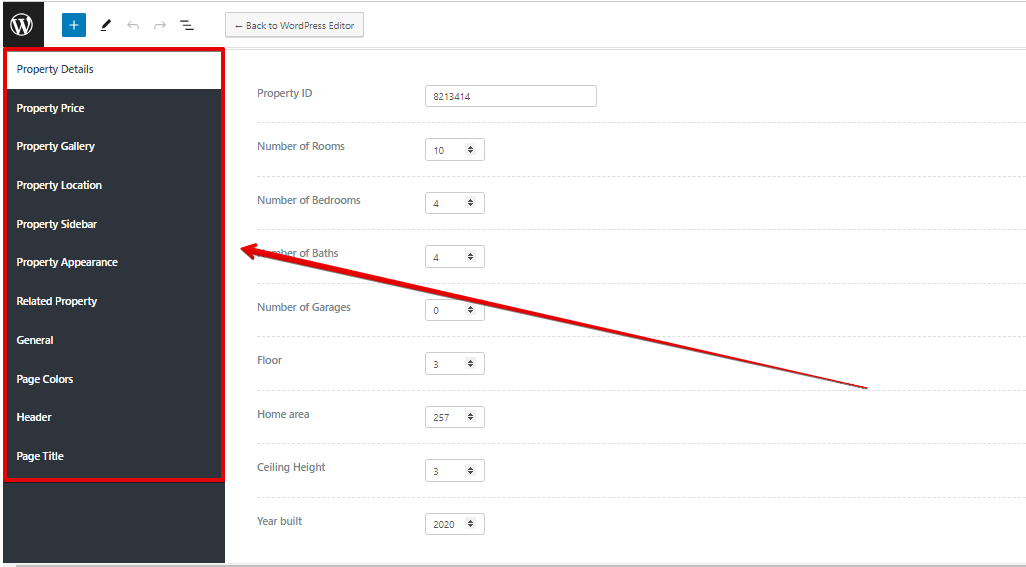
- Property Details - provides the ability to manage the property values (number of rooms, floor, etc).
- Property Price - set price and individual values for the currency.
- Property Gallery - add additional images of the property.
- Property Location - manage individual location.
- Property Sidebar - set sidebar with individual information for a certain post.
- Property Appearance - manage post-meta information.
- Related property - manage the related posts for individual algorithms.
- General - body styles.
- Page Colors - manage the colors for every page separately.
- Page Header - set individual Header.
- Page Title - disable Page Title or set idividual image for a certain post.
All items for filtering by certain requirements, should be added inside your dashboard > Properties > Categories/Types/Status/Amenities/Locations > Add New.
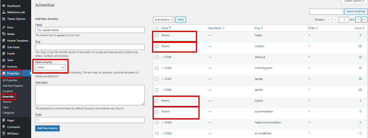
Every Single property contains the Amenities section. It collects child elements into groups of parent elements.
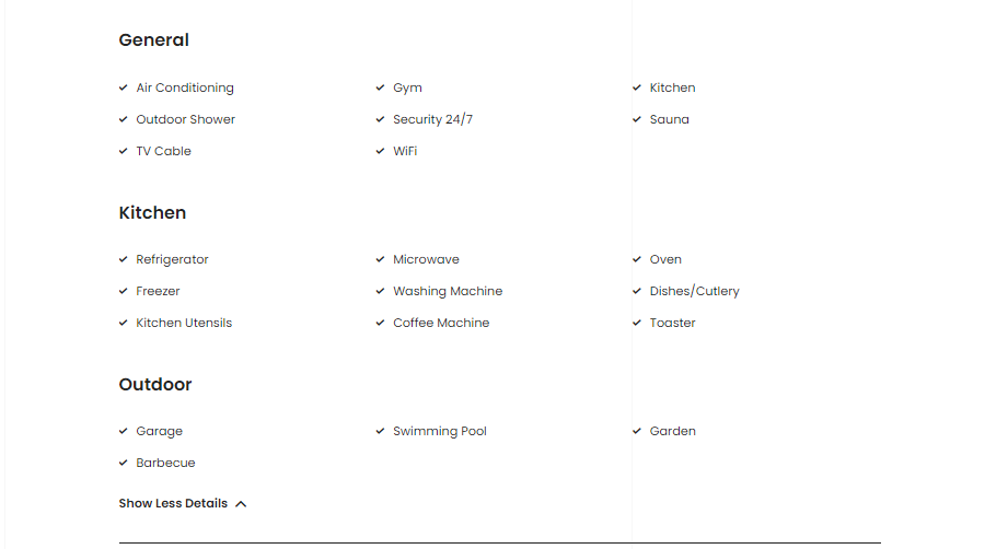
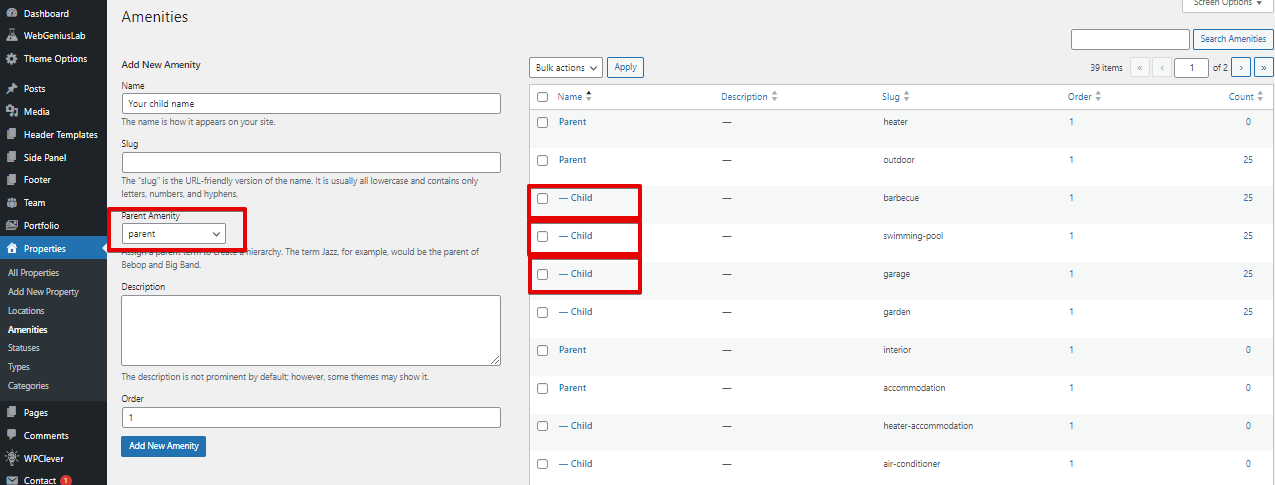
The Amenities could be added inside your dashboard > Properties > Amenities. To create a similar group with sub-elements you need to create some kind of hierarchy.
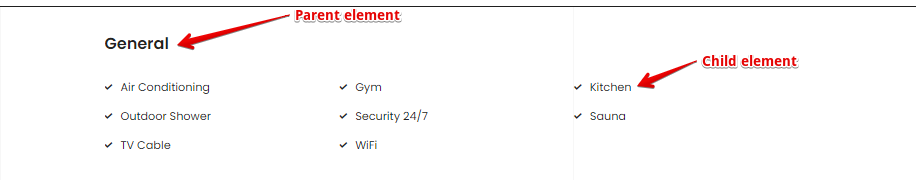
In order to get a"title" you need to create the parent element:
For creating "sub-elements" you need to create the child elements by selecting the parent Amenity:
Properties modules for Elementor
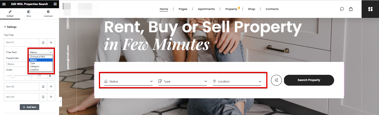
The WGL Properties Search provides the ability to filter the Property posts.
- Top Filter - add the values for filtering by: status, type, category, location;
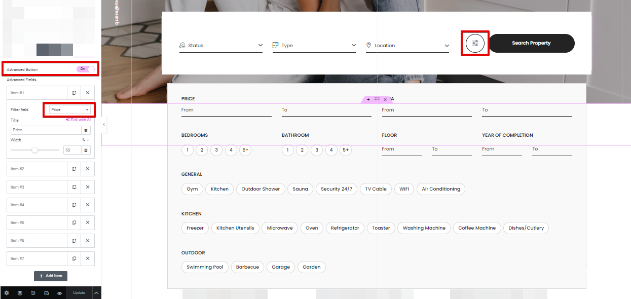
- Advanced Fields - enable advanced button to get the additional field for filtering;
The WGL Property - module for displaying all existing properties in Grid layout.
Support
If you did not find an answer to your question, please feel free to contact us.
Email: - webgeniuslab@gmail.com
ThemeForest Account: - WebGeniusLab